

Thank you for taking the time to read my individual and group blogs. You will find my finished video, album cover and website at the top of the blog, and are also available on our group blog.
To the right are some helpful links to relevant blogs as well as a lables list. All posts here and on the group blog have lables relevant to their content.
Please enjoy all the features I have available here, dating back to initial research in october.
- Eoin Brogan, Candidate Number 3100
Friday 16 December 2011
This blog is now CLOSED!
This blog is now officially closed!
I am already reminicing about how much fun I have had over the weeks doing this project. I have been looking forward to this since I joined media in year 10 and it has far surpassed my expectations.
I have made an awesome video, and more importantly, some great friends.
I am already reminicing about how much fun I have had over the weeks doing this project. I have been looking forward to this since I joined media in year 10 and it has far surpassed my expectations.
I have made an awesome video, and more importantly, some great friends.
Thursday 15 December 2011
Evaluation Question 4
How did you use new media technologies in the construction, research and planning and evaluation stages?
Production:
Cannon 550D

The Cannon 550D is an impressive camera. Although it's designed to be a stills camera it is still able to capture very high definition film. Luckily for my group I happen to own this rather exquisite camera, and we were extremely lucky to be given Premier Pro CS5 to edit on because it's one of the few softwares that's able to handle the quality. This is a very new media technology because it films onto digital memory rather than tape. This allowed us to avoid capturing in the lengthy process we're used to and to instead copy the footage straight over. The camera was easy to handle for handheld shots and this gave us a variety of options while filming.
Lights

Strobe; 650 Watt Redhead lights; Neon Bulbs
Artificial lighting was only necessary for our performance. Natural, outdoor lighting proved to be excellent for the narrative filming, especially under the lens' of the canon.
For the performance, however, we had to use a set of 3 650 watt Readhead lights. In total we had 3 performance shoots, and although our first shoot was over-exposed, it proved to be a learning curve and the second and during the second and third shoots the equipment proved invaluable.
For the second section of our performance, we decided to use neon paint which meant that the lighting needed to change. We used 2 neon bulbs, one above the performance and another at the side. Without those bulbs the neon element would not have been possible and there would have been no progression to our performance.
Premier Pro
Premier Pro CS5 was a fantastic editing software. Having a firm knowledge of CS3 I got to grips with the latest update quickly. We used Premier Pro to edit our track. The brief stated that our video must be 3 minutes or less, and our track selection was 4 minutes 30 seconds; even though Premier Pro is primarily for editing video, it worked brilliantly for cutting down and marginally speeding up our track, so it was under 3 minutes long.
We also used Premier Pro to create a promo montage-style video for the screening of all our music videos.
Photoshop
Photoshop was used heavily throughout the construction of our video, website and album cover. The album cover template itself was presented to us in a photoshop (.psd) format, making it the essential software to use for stills editing and graphics.
We created our main band logo on Photoshop:

After making this logo the blue and black colour scheme became consistent to our branding; as did the font of our name. The smokey effect round the letters was achieved through Photoshop and was also a motif we used across our album cover and website.
See here our album cover, which was entirely constructed in Photoshop:

We used Photoshop to edit promo pictures of the band, which were then used on our album cover and website. It helped us change the tints of pictures and put effects on them which suited our cold and metallic colour scheme.
The top shot is after the editing, the bottom is beforehand.


We used Photoshop to create a poster for an event with our band and another groups band together. We thought this was a good example of synergy, and could be made possible by Photoshop.
Colour
Here is a short video demonstrating the uses of our colour correcting software:
Web 2.0
Web 2.0 was used so much in the construction of our product. Particularly Wix.com was the website we used to make our website. It is a flash based online website designer. We were the first year in our school to get to use this software, and it proved to be a fantastic way to integrate our website in with the rest of our project.
You can embed videos, pictures, hyperlinks and sound files in to your website through Wix, and it allows for high levels of visual customisation, with many buttons, effects and features available.
Research:Web 2.0 was used so much in the construction of our product. Particularly Wix.com was the website we used to make our website. It is a flash based online website designer. We were the first year in our school to get to use this software, and it proved to be a fantastic way to integrate our website in with the rest of our project.
You can embed videos, pictures, hyperlinks and sound files in to your website through Wix, and it allows for high levels of visual customisation, with many buttons, effects and features available.
Web 2.0
Google street view allowed us to location scout without having to leave our homes. Using youtube for inspiration, facebook questionaires to get an idea of what our audience likes, looking at other bands websites.. The list of uses is almost endless.
Before even proposing and song and video idea, we needed to gather information and inspiration from the huge array of videos now available online, through services such as YouTube and GoogleVideo.

Evaluation:
Web 2.0
YouTube and Facebook for posting our video and receiving feedback; and the YouTube video statistics will prove interesting later on after some views have (hopefully) amassed, we will be able to see if our video is watched by the demographic for which it was intended.
Using Facebook, we also made an event for our screening, which helped to promote it.

And finally, arguably the most important new media technology we have used:
BLOGGER!
We have used Blogger across all areas of the project; it is how we present all of our work and research findings to our teachers and examinator and the overall framework of our project.
All along the way, we have used blog posts on both our individual and group blogs to log progress and to present our portfolio.
Evaluation Question 3
What have you learnt from your audience feedback?
What have I learnt from this?
We decided the most useful audience feedback we could recieve would be from a range of people, and the video above summarizes some of our responses.
Our target audience was 16-24 year old males, with secondary target audiences including younger males (10-16) young adults (24+) and perhaps girls aged from 10 to 24. This was picked up on by everyone we interviewed, and anyone from our target audience who watched it failed to give it less than 8 out of 10. From this I have learnt that our attempts to link to our target market, with a fully male band, male lead in the narrative and dark set up, has been fully successful.
The strong points that have been mentioned were the editing, the strong performance in both narrative and performance parts of the video and particularly the UV section at the end. This has shown me what kind of things audiences look for. They want strong visual stimuli and just mainly to be kept entertained, which we achived through a strong progression in our video.
Some negative points include that our middle section sags slightly, as we reuse the idea of my character running, being cornered, then escaping once more about three times in a row. This simply re-enforces what I've already learnt from the possitives, namely that progression is what is needed to entertain an audience.
The most unfortunate feedback which we have recieved throughout the project is the lack of focus on the UV and kiss scene at the end. This was due to time constrains and could only have been made to work better had we been allowed to use the entier track. I have learnt from this that sometimes things just don't work, through no fault on our part. However the ending is still effective and I'm still proud of it.
Evaluation Question 2
HOW EFFECTIVE IS THE COMBINATION OF YOUR MAIN PRODUCT AND ANCILLARY TEXTS?
Throughout this project we have had to consider how well our main product and ancillary texts brand our band through synergy.This has to be kept consistent as it is extremely important for a debut artist to build a strong identity so as to stick in the minds of the audience.
You may also notice the use of our logo on the front cover of the album. This was a symbol I came up with while doodling in my English book. It combines three triangles to make one in the center, much like the three members of the band. The symbol also looks quite occult, as I took inspiration from the 'pentagram' or 'never ending star.'

This logo was used repeatedly throughout the video as well. We painted it onto the backdrop and also painted it onto my chest during the UV section of the performance.

We designed our website the way all good artists do: we designed it as the base of all our operations. It is the hub of our marketing campaign. It is as interactive as possible, with the audience able to contact the band, view the video, album, latest news and see upcoming gigs. We also made a Facebook and Twitter page for our band. Our target audience is young men, and over 90% of 16-24 olds use social networking sites. By adding our band to these sites we broaden our reach and appeal to suit their needs, integrating it all together through the website.
The idea is for it to be as user friendly and integrated as possible, the end goal being for the consumer to purchase our track and / or video.
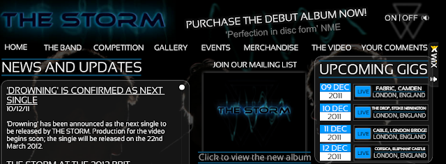
You can see here the top banner of our website. This remains at the top of the screen constantly, allowing (no matter what the audience is looking at) the viewer to have access to purchase our new album by clicking on the link and being taken to itunes. You can also always see the bands logo constantly in the top right hand corner, which feature in the music video and on the album cover, as well as their iconic typeface, which is on the front cover of the album.
As you enter the website, our track plays automatically, and there is a tab which lets you view the finished video. There is also a link to YouTube in the bottom right of the page which takes you to our video. We also wore the same costume for our promotional shoot as we did for the video, and for the shots used on the album inside cover; some cross platform marketing, this would become the image and dress style of our band.

All three texts very clearly link together just by looking at them, and each one links to the other. The album sparks interest in the band by alluding to the fact that there's more to learn, through the silhouettes and half hidden logo. The music video is open to interpretation and has glimpses of our logo. This leads audience members to want to view more of the bands work and the website satisfies that. In short, I believe all texts work highly effectively in combination.
Evaluation Question 1
IN WHAT WAYS DOES YOUR MEDIA PRODUCT USE, DEVELOP OR CHALLENGE FORMS AND CONVENTIONS OF REAL MEDIA PRODUCTS
Using Barthes Enigma Code
The main enigman in the video is present in the narrative. The narrative has been left deliberately open ended, with little explaination into Eva's character. Audience feedback gave mixed responses, which was to be expected. However, all feedback adhered to our original idea of a boy battling with his past demons and then coming to grips with them and finding peace, symbolised by the switch in power then the kiss and fading of the girl at the end. This is a convention of music videos of our genre: to include open ended narratives that let the audience interpret what really happened.
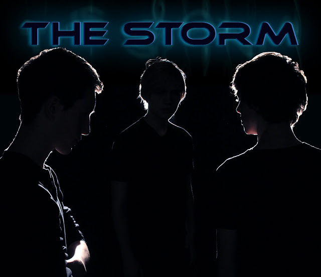
The media product we created is a new drum and bass band called 'The Storm.' Their debut music video release and the album cover and website promote them as well. This project required us to think about conventions of existing debut artists; then make decisions whereas to use, develop or challenge these conventions in a way which worked beneficially to our overall project.
Using Barthes Enigma Code
The main enigman in the video is present in the narrative. The narrative has been left deliberately open ended, with little explaination into Eva's character. Audience feedback gave mixed responses, which was to be expected. However, all feedback adhered to our original idea of a boy battling with his past demons and then coming to grips with them and finding peace, symbolised by the switch in power then the kiss and fading of the girl at the end. This is a convention of music videos of our genre: to include open ended narratives that let the audience interpret what really happened.
Our album cover
We took inspiration for this minimalistic colour scheme from existing drum and bass bands. Pendulum, Skrillex, Sub focus and Magnetic man to name but a few. The font is also inspired by these artists, drawing on their sci-fi feel, which stems from the electric aspect to the music.


As you can see above, our website has many similarities to pendulum's website. We have a large range of posts on the website orientated mainly around the live gigs. On the home page, the news feed and events page are as many reference to these gigs as would fit. This is because THE STORM, like many drum and bass artists, is all about the music. The website also stays true to the branding of THE STORM, with the colour scheme, choice of photos and use of the logo. This is a very common convention of all music artists as it keeps the band in the audiences mind.

Our website


As you can see above, our website has many similarities to pendulum's website. We have a large range of posts on the website orientated mainly around the live gigs. On the home page, the news feed and events page are as many reference to these gigs as would fit. This is because THE STORM, like many drum and bass artists, is all about the music. The website also stays true to the branding of THE STORM, with the colour scheme, choice of photos and use of the logo. This is a very common convention of all music artists as it keeps the band in the audiences mind.
Thursday 8 December 2011
Website sign off
 |
| Our Website, made on Wix.com |
Tuesday 6 December 2011
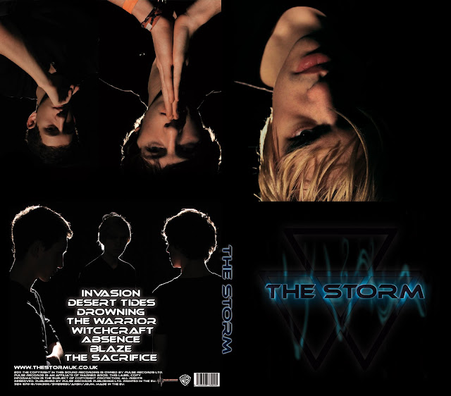
Album cover sign off
Our album cover has now been signed off too.
The front cover doesn't include a picture of us, following the conventions of drum and bass albums. It does however have our shade of blue that we've used throughout the website. The logo is also used as a form of branding.
The inside has a progression of us, leading from me back to George. It took a lot of editing to get all the shots looking the same as they all had different lighting. However, the end result looks fantastic.
The back includes titles which took a lot of thought. It also contains the shade of blue that's included across our products and a picture that's used on the background of our website.
 |
| The inside cover of our album |
 |
| The back of our album cover |
 |
| The front of our album cover |
The inside has a progression of us, leading from me back to George. It took a lot of editing to get all the shots looking the same as they all had different lighting. However, the end result looks fantastic.
The back includes titles which took a lot of thought. It also contains the shade of blue that's included across our products and a picture that's used on the background of our website.
Subscribe to:
Posts (Atom)